


Taking better food photos
8 tips from personal experience

When I first became interested in cooking, I would often take photos of things I cooked to share with friends, and eventually the broader public on platforms like Facebook and Instagram. Early on, I would get frustrated at the disparity between the food I cooked and the photo I took. The food was tasty, delicious, a delight to eat; but most of the time it looked horrendous, both on the plate and as a photo.
Eventually, I decided to throw some attention into the basics of photography. Very gradually, through mostly trial, error and intuition I learnt how to take decent photos.
Over the last couple years a few people have asked me for tips on how to take better photos, which has caused me to think analytically about what makes a good photograph. Mostly though, I held onto the belief that basic principles couldn’t be so easily distilled into tactical tips. But the more I thought about it, the more opposite seemed to be true: that there are a few very concrete, tactical pointers a beginner could employ to drastically improve the quality of their food photographs. This article is nothing more than an articulation of those simple tips. Anything more than that is beyond my scope of knowledge. Accordingly, this piece is written for those who are novices; who enjoy cooking and are at times disgruntled at the mystery of what makes a good photograph.
I’ve divided this article into two sections: presenting the food, and making a photograph. I think this is a useful framework to think about taking a good photo of food. Presenting the food, which involves plating, bowl colour, plate size etc. is a requisite step before one considers all the elements of making a photograph - i.e camera angle, composition, light, and basic editing.
Finally, it must be said these tips aren’t zero sum rules. That is, they are not the only way to skin a cat, but they are often the easiest way to do so. Also, whilst some of these tips follow convential wisdom - i.e. making use of natural light, others like ‘fitting foods snugly’ are more personal articulations of what has worked for me, distilled into my words. So as with anything you read on the Interwebz, take it with a grain of salt.
One last word. I intended this piece to be brief, but it has become rather voluminous. Such is life. Below is the tl;dr
Present food as it is traditionally eaten.
Use plates and bowls that provide contrast to the colour of your food
Plating — fit foods snugly inside the serveware
Plating — avoid even numbers of things
The best location for taking a photo in your home is generally next to a window, on an overcast day
Limit your thinking to three simple camera angles
Focus on the food and the food only, avoid props and background objects
Learn, and get a sense of the rule of thirds
Note - all photos in this article are my own unless stated.
Presentation
1 — Present food as it is traditionally eaten
This is one of the quickest, lowest-effort way to improve the visual appearance of a dish. It does, though, require a basic understanding of the cultural context behind food. I’m not sure why it works but it does.
Take a Thai green curry as an example - in the West at home, we often serve a Thai curry with rice in a single bowl as a whole meal, and we’ll make as many bowls of this as we have eaters.
By contrast, in Thailand, traditionally a curry is a single dish served alonside other single dishes like relishes, grilled meats, salads, soups and of course rice. Eaters eat communally, they typically have their own bowl or plate which they would first add rice to then little bits of each dish in a communal fashion.


The same line of thinking can be applied to stir-fries. Again, in the West we’d often think to present a stir-fry with rice as a single dish (which is totally fine, practical, normal and probably what people from all cultures East and West do). However, in the context of this article the tip is to present food how it is traditionally eaten. So, again if we think about how stir-fries, which originated from China, were traditionally eaten we will recognise that they similarly were communal dishes alongside many other dishes which eaters would share.


Same thing applies to dishes like stews, braises, etc. Rather than snapping it with its accompaniement be it mash, rice, polenta or whatever - just present it by itself and you’ll have a beauty. Conversely, take pasta as an example. Ever seen photos of someone plating up a pasta with a hunk of grilled, sliced chicken breast set atop? It’s whack, it looks bad. Why? Perhaps this principle is the reason.
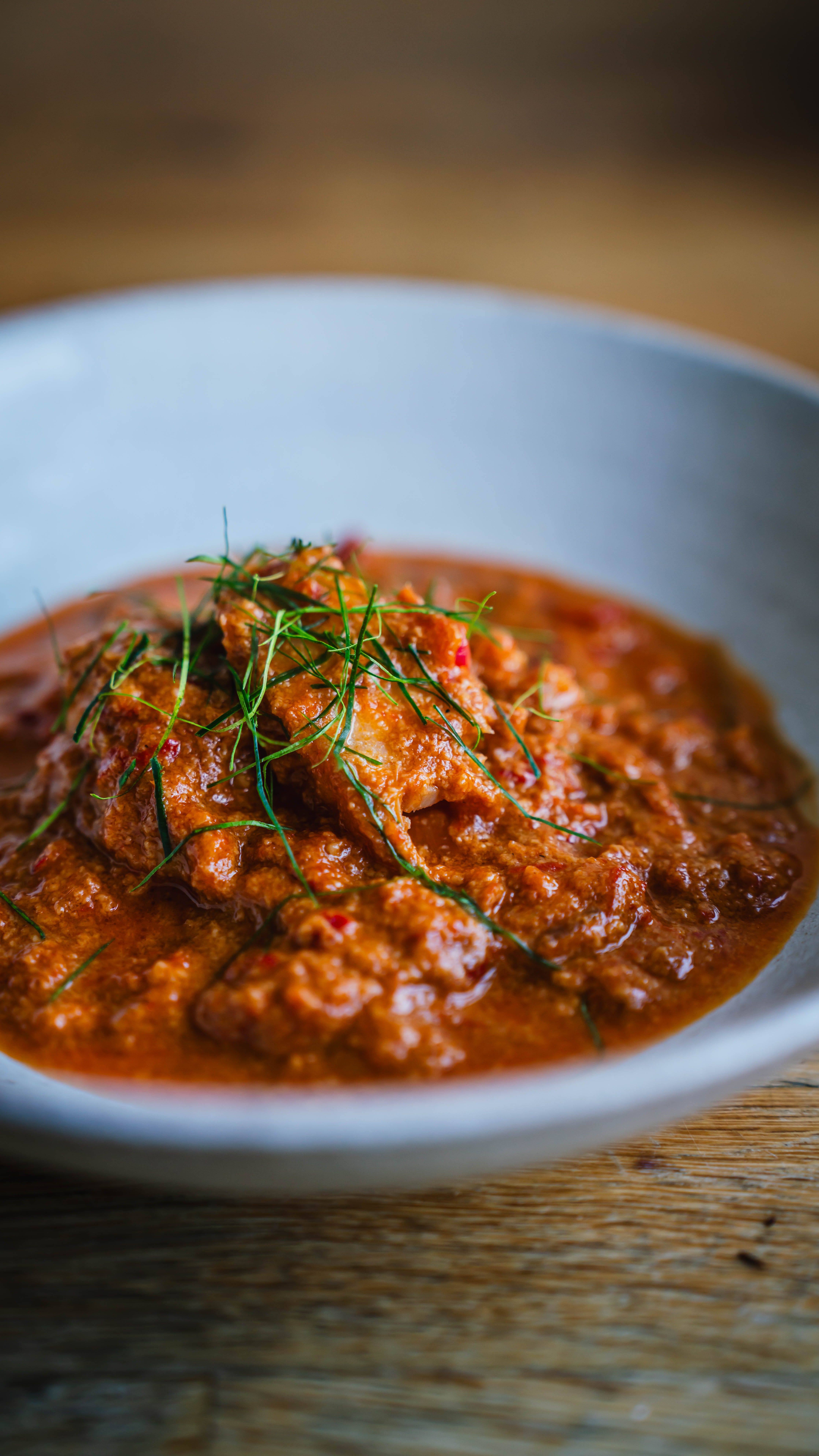
2 — Use plates and bowls that provide contrast to the colour of your food
Contrasting colours can be visually appealing, whereas monochromatic plates are often uninspiring1. Accordingly, I’ve found that a quick way to make for a better presentation of food is to make sure the food contrasts with the serveware. The below shot of a wonton soup is an example of a bowl of food with little contrast; the soup is beige, the wontons are beige, the counter is beige, and the bowl has a similar neutral tone.
Compare this with the below plates of food where there are clear and distinct colour contrasts - black and yellow; green and blue; brown white and green.


As such, it is very helpful to have a large collection of plates and bowls of different colours and textures. Some colour combinations that tend to work well are black and yellow, white and dark brown, green and blue, green and black.
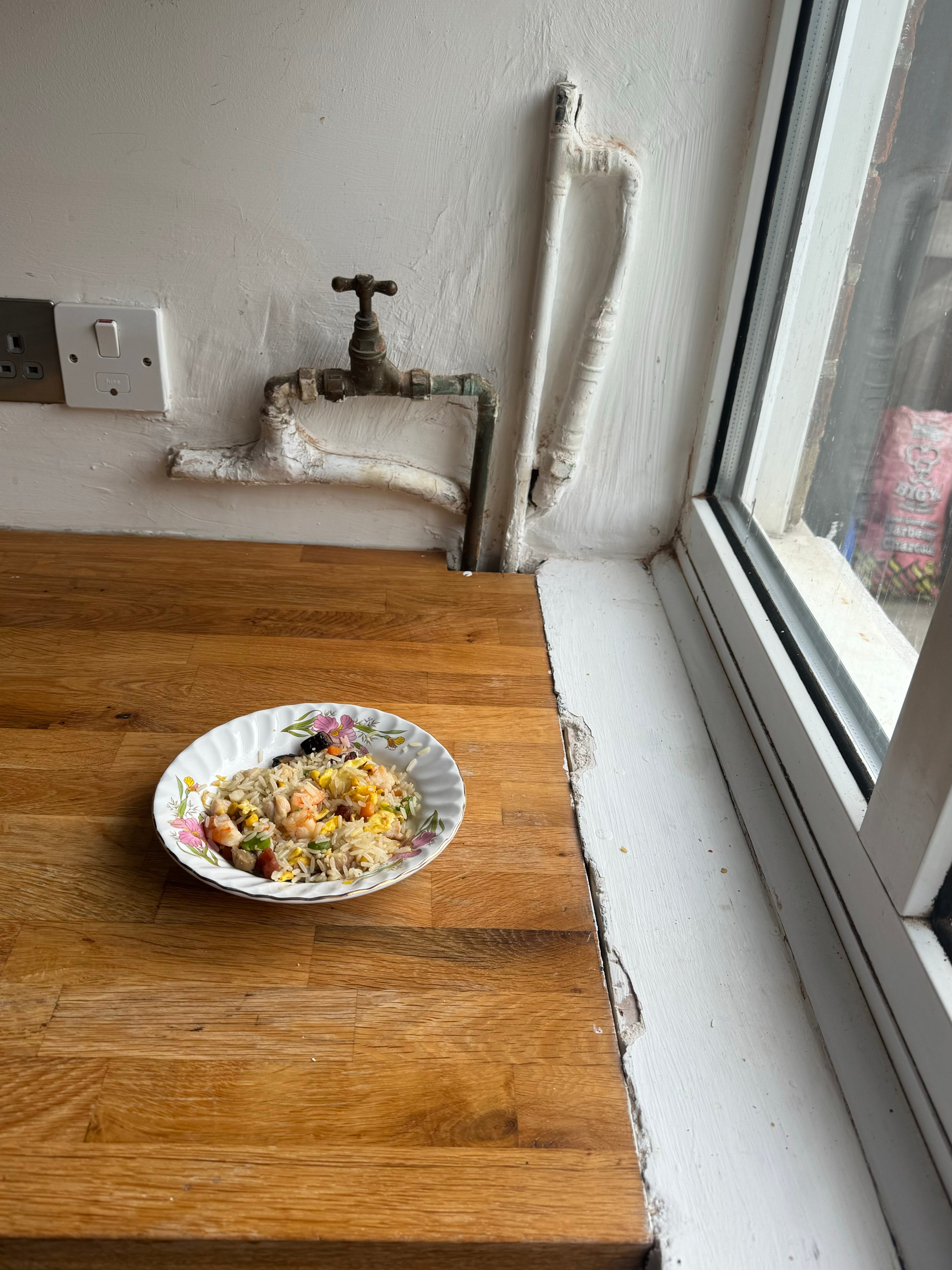
3— Plating: Fill foods snugly inside serveware OR be conscious of how to use negative space
Again, in the spirit of this article being an aritulation of quick guidelines to make better photos - I used to find it helpful to think of plating food in two ways: (a) making it fit snugly inside the serveware, or (b) making clever use of negative space. This is incredibly reductionist but it suits the nature of this piece. Here are some examples of food fitting snuggly:


As you might notice from the above shots, a lot of foods are oval in shape like fish, chops, steaks etc. That’s why I’ve found it important to have a few oval plates alongside standard circle ones.
Some foods are hard to fit snugly; foods like asparagus, dumplings, ribs and many others. Other dishes just don’t adhere to this ‘fit snugly’ rule, for example dishes where there are lots of different ingredients, such as a roast or a meat and two veg type dish. In these instances I found it helpful to try and be conscious of negative space, i.e the space around your subject (food). This is a hard one to explain but I find placing food off centre is helpful and ensuring the negative space is greater than 20% of the total area of your plate. Below are a couple of shots which I think make decent use of negative space.


Whereas the following three shots have little consideration for negative space.


4— Plating: Avoid even numbers of items
This one is very simple and is a common design principle. If placing individual items on a plate or in a bowl - avoid even numbers. For some reason they look bad to the eye. Take the below comparison as one example.


Taking the photograph
5 — Light: Take your photos next to a window, out of direct sunlight
Generally speaking, the best place to take a photo of your food at home is by a window, on an overcast day, with the window directly next to your food and you directly in front of your food. This tip alone can drastically improve the quality of a photo, especially in conjunction with the above pointers on presenting your food. Below, I’ve given a very brief description of how light affects photographs - which in turn will explain why a window on an overcast day is generally the choice place for a photo at home.
Light is the most important variable to understand in photography. There are literally volumes upon volumes of books2 on the subject of lighting in photography so the topic is dense. But in an effort to distill the most practical guidelines, I have jotted down some important points below.
When light passes through certain materials (called diffusers) like clouds, white sheets, white curtains, frosted glass etc, it scatters, dispersing more evenly. This is called diffusion, and the light it creates is called diffused light.
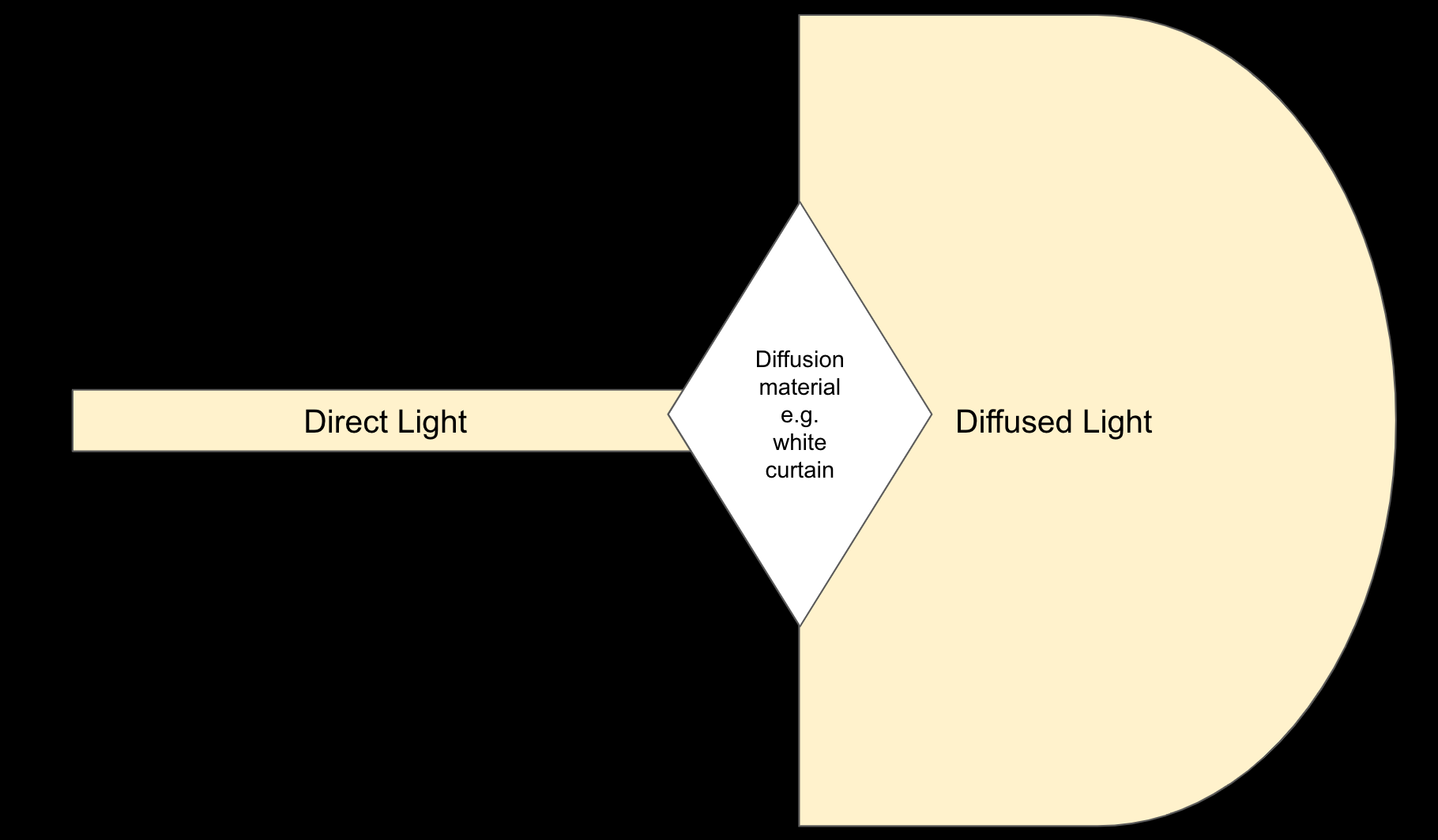
Direct light, that is, light that has not been diffused for example direct sunlight, or light from a flashlight is bad for taking photos because it creates harsh shadows.
Diffused light is good because it creates soft shadows. See the difference between the two types of light in the two images below.


The color of light is also important. The nuances of natural light is beyond the scope of this article so I’ll just say here that generally speaking, the novice doesn’t need to worry about the color of light when shooting in daylight. Artificial light is a different story. The color of light is referred to as color temperature and is measured on the Kelvin scale. On the high end of the scale, say 15,000 Kelvins (e.g a photo taken at the snow with clear blue skies) the color of light is blue and is deemed a ‘cool’ temperature. On the other end of the scale, say 2,000 Kelvins (e.g. light emitting from a candle) the color of light is orange and is deemed ‘warm’. An overcast day sits at around 6,000 Kelvins. Too warm or cool a temperature generally makes for very bad photos. House lights, e.g. kitchen lights, lamps etc. tend to be very warm. They also have little diffusion. This is why trying to take a good photo at night time under standard kitchen lights is near impossible.


6— Camera angles: Limit yourself to three angles when approaching a shot — 90 degree (top down), 45 degree and 75 degree.
When I first started taking photos of food, I was frequently overwhelmed when approaching a shot. I didn’t know whether to take it from the side, top down, close up, high up etc. One guideline that helped me was limiting my thinking to three angles: top down, 45 degree and 75 degree.


I found that once I started to limit my thinking to these three angles it reduced my feelings of overwhelm - it was simply something I could do easily and automatically do when starting a shot, without worrying if I were right or wrong.
The second benefit was that it made me get very comfortable with these three angles which in turn caused me to intuitively understand what foods are best suited for which shots. Even today, I often don’t know what type of shot will be best for which plate of food. But I’ll often take shots from each angle and pick my favourite.
7— Composition: Focus on the food only, avoid props and background objects
Composition can be defined as what you decide to include in your frame. If I had my time back, I would avoid trying to stylise fancy photos with scattered leaves in the background, misplaced props etc etc. I’ve come to hate this style of food photography. It looks forced, contrived and totally unrealistic. It also takes away from the essence of the food.

It’s much easier to focus and celebrate the plate of food. It’s far simpler to make the photograph look better this way also.


8 — Basic Editing: Learn, and get a sense of the rule of thirds.
Like lighting, compositions presentation (basically everything in this article) the topic of photo editing is broad and complex. So again, in the spirit of this article being digestible, and in keeping with my desire to not talk too much about topics I am not an expert on - I will keep this short. So short that I am only going to talk about one tiny part of editing - cropping.
So, put simply, learn how to crop your photo in line with the design principle known as the rule of thirds. The linked article will explain it better than me, but at a high level the rule of thirds is a design principle which suggests visual images should be divided into 9 equal parts by two horizontal and two vertical lines. The most important compositional elements should be placed along these lines. The rule of thirds explains/suggests why you should generally avoid placing your bowl of food in the dead centre of the image.

There are many, many more visual image designs that one can learn and intuit but this, at least in my experience, is a very quick and easy way to improve the look of your photos if your starting out. Most photo editors (e.g. Lightroom, the Apple photos app, VSCO etc) will allow you to display rule of thirds gridlines like in the image above.
Finally - as a bonus tip, if anyone is interested in editing beyond cropping - e.g. adjusting various parameters in Lightroom such as highlights, white balance, etc. I remember watching this video a few years back and I found it incredibly helpful in providing some very simple tenants I could get started with in terms of basic photo post production.
OK, that’s a wrap. Thanks for reading.
Monochromatic plates of food can be beautiful but they require a keen eye and a deft touch to be able to exectue properly.
For anyone interested, ‘Light - Science and Magic: An Introduction to Photgraphic Lighting’ is a great foundational book